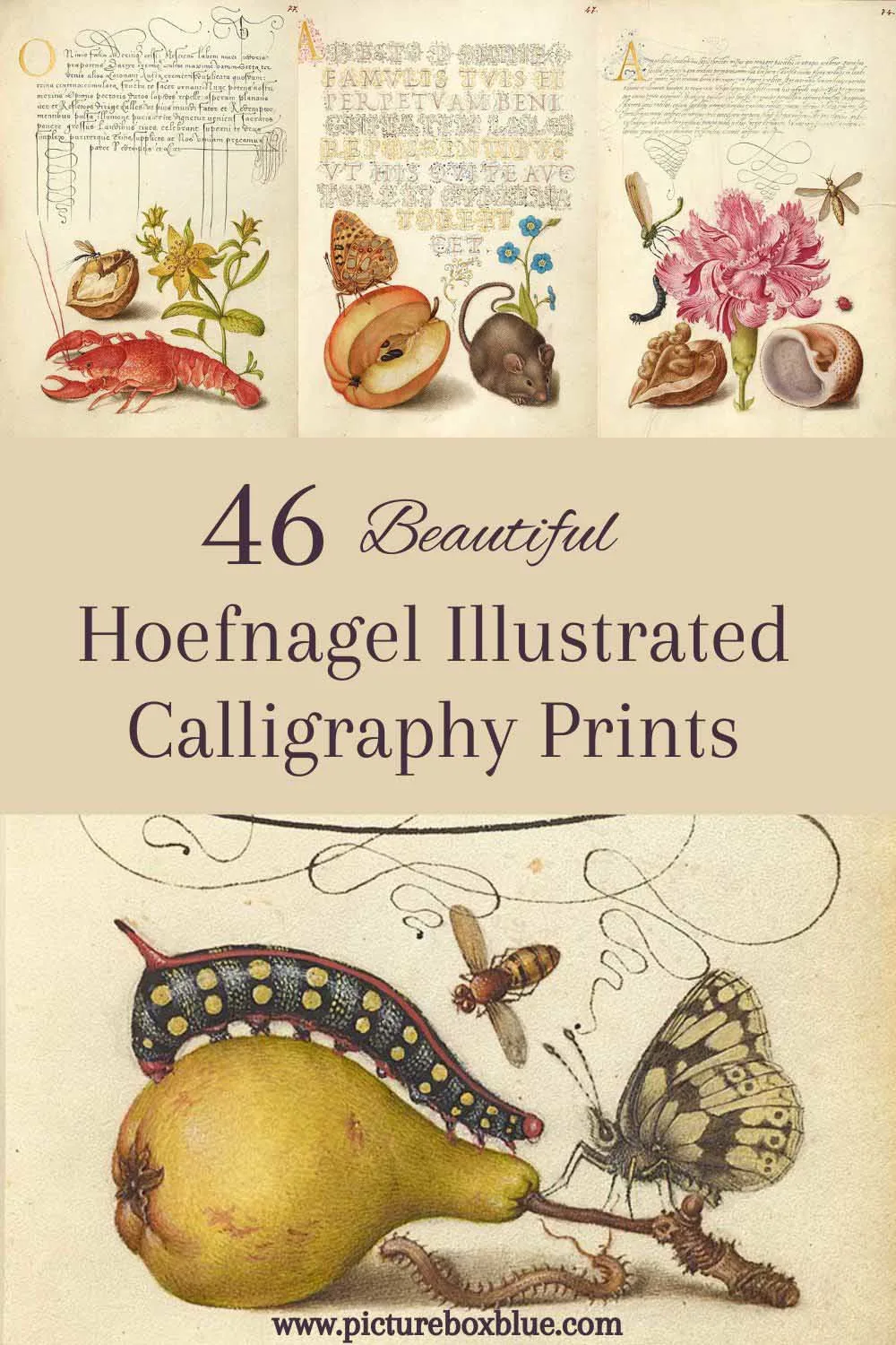
Inside: A collection of 46 beautifully illustrated old calligraphy letters by Joris Hoefnagel from the classic book “Mira Calligraphiae Monumenta.“
If you’ve seen the Joris Hoefnagels insect paintings on the site, you will know how artistically talented he was. The Holy Roman Emperor Rudolph II was a fan of his work and commissioned him to illustrate Georg Bocskay’s seminal calligraphy book.
What Was The Mira Calligraphiae Monumenta
The “Mira Calligraphiae Monumenta” (The Model Book of Calligraphy) was a very important sixteenth-century on the art of calligraphy.
Georg Bocskay designed the calligraphy letters, and thirty years later, Hoefnagel added beautiful illustrations of fruit, flowers, and insects to them.
The book was created using a combination of traditional and innovative techniques. Bocskay used a quill for the calligraphy, while Hoefnagel used watercolours and gouache to paint the illustrations. They also used a silverpoint technique involving a silver stylus to create fine lines on paper coated with a special preparation.
Mira Calligraphiae Monumenta is a stunning masterpiece and is regarded as one of the finest examples of calligraphic art and miniature painting from the Renaissance period.
The manuscript is now housed in the Getty Museum in Los Angeles, California.
Joris Hoefnagel The Influential Artist
Joris Hoefnagel was a seminal artist of the late Renaissance period, and his work influenced the Dutch masters in the following ways:
- Attention to detail in his depictions of plants, animals, and insects. This attention to detail was later adopted by many Dutch masters, who sought to create paintings that were as realistic and detailed as possible.
- Use of symbolism, Hoefnagel used symbolism and allegory in his work, with hidden meanings and subtle references. Many Dutch painters later adopted similar techniques to convey complex ideas and themes in their paintings.
- Interest in the natural world, as well as an artist and naturalist Hoefnagel. This interest in the natural world was later adopted by many Dutch painters, who sought to capture the beauty and diversity of the natural world in their paintings.
- Illumination and calligraphy, Hoefnagel was also known for his work as an illuminator and calligrapher. Many Dutch painters later adopted his elaborate lettering and intricate designs and used similar techniques to add decorative elements to their paintings.
You can see some examples of the influence Hoefnagel had on the Dutch masters with this collection of Still Life Flowers paintings.
How To Download The Old Calligraphy Prints
Click on the title above the old calligraphy print that you want and higher resolution image will open in a new window. If you then click on that illustration you will be able to print or save it.
All the prints from the “Mira Calligraphiae Monumenta” are in the Public Domain and thus copyright free.
There are over 45 old calligraphy letter prints to choose from. The first 23 cover the letters of the Latin alphabet. And then the next 15 contain beautiful natural history paintings of fruits, flowers and insects used to illuminate the old calligraphy pages.
Then at the end are more illustrated calligraphy guides for symbols.
The calligraphy was done by Georg Bocksay and the illustrations Joris Hoefnagel.
Old Calligraphy Letters A to E
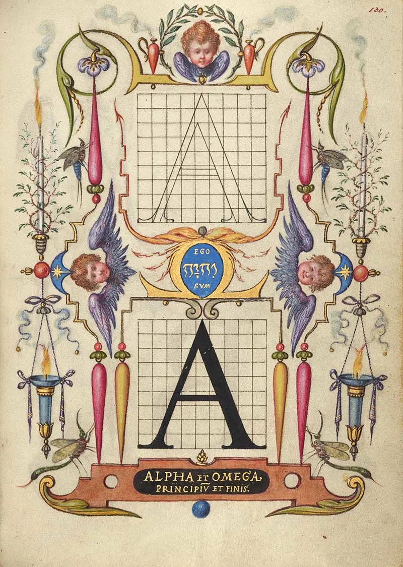
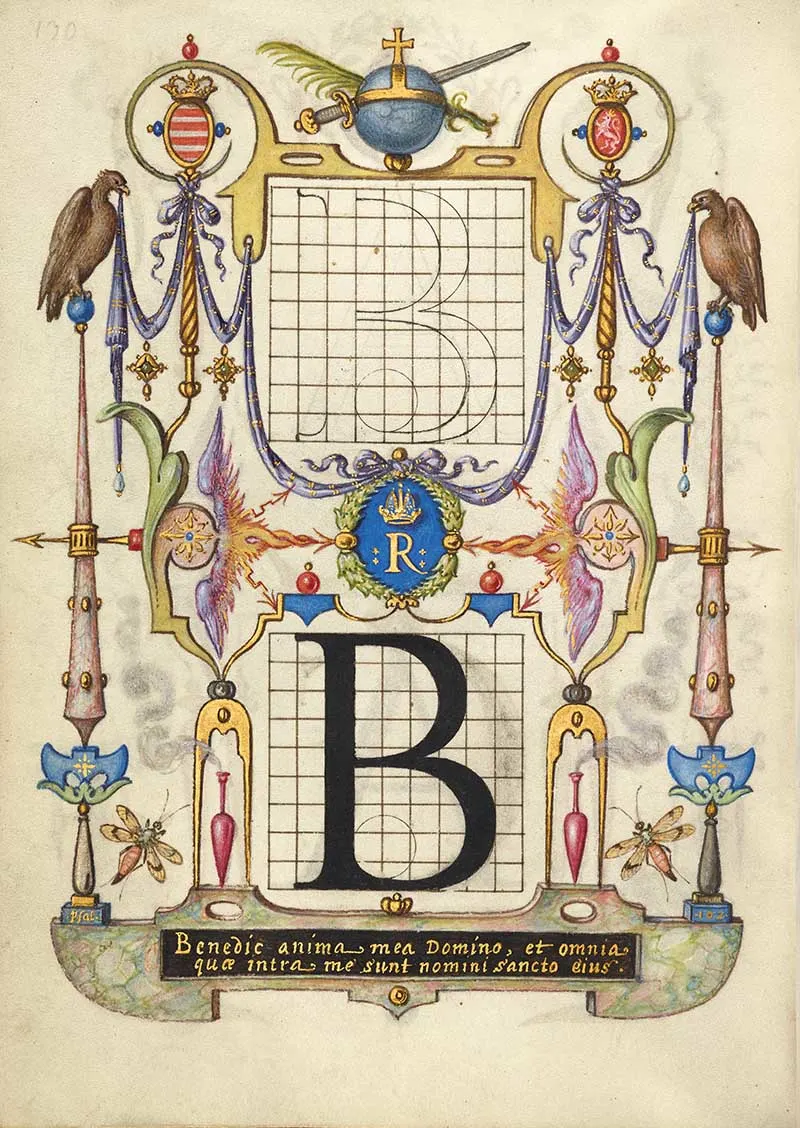
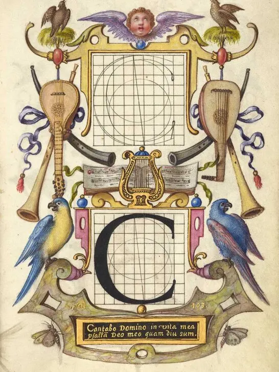
The following illustrated prints are guides to constructing each letter of the alphabet.
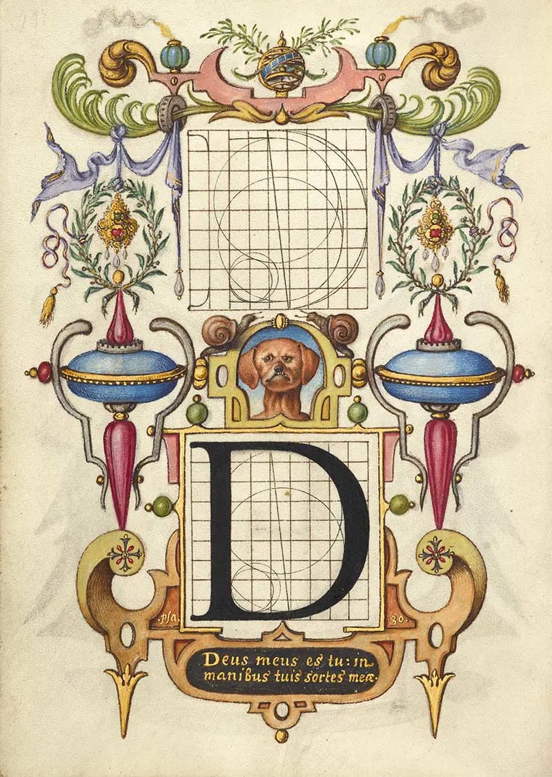
With the illustration in the middle of this print, I like to think of it as “D is for dog”. But I know that is probably not the case, as the word for dog in Latin is canis.
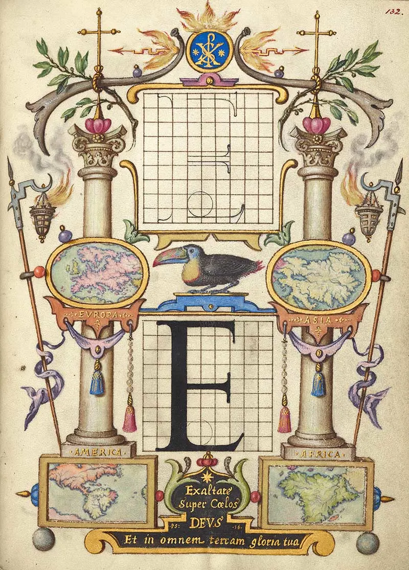
This old calligraphy letter E is illustrated with maps of major continents and a toucan in the middle.
The toucan probably does not have a specific symbolic meaning but interested Hoefnagel because of its rarity.
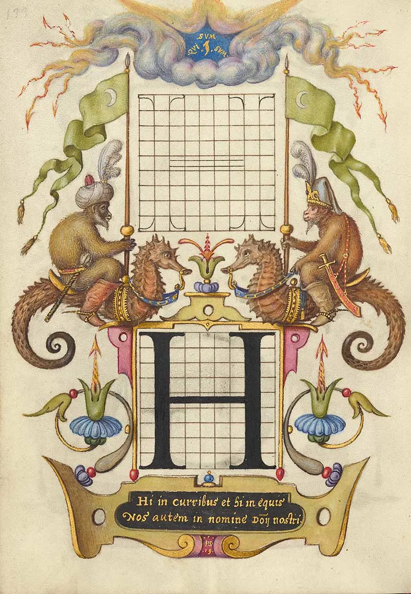
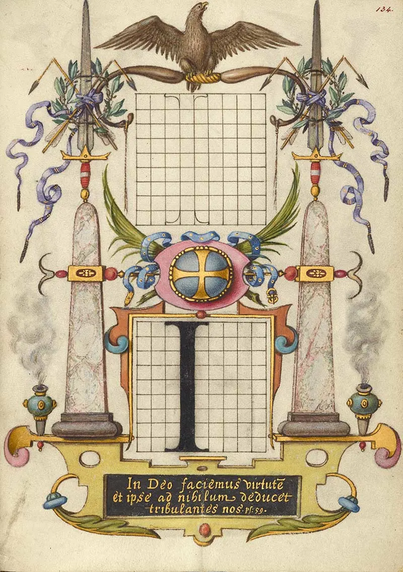
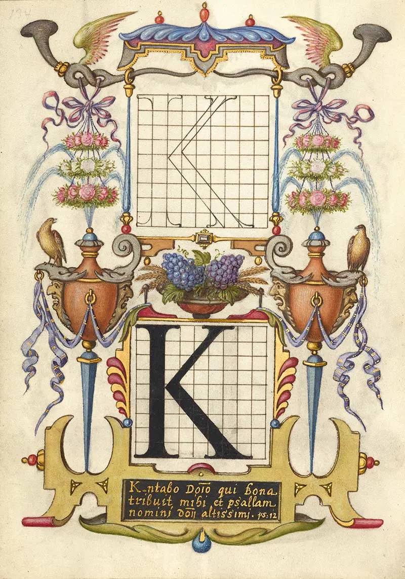
Old Caligraphy Letters F-K
You will notice that this alphabet of constructed letters is missing the letter J. That is because there was no letter J in the ancient Roman alphabet.
The ancient Roman alphabet had no letter J.
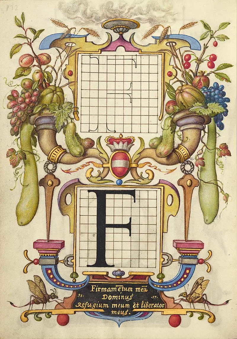
With the illustrations on this calligraphy print, I like to think of it as “F for fruit.“
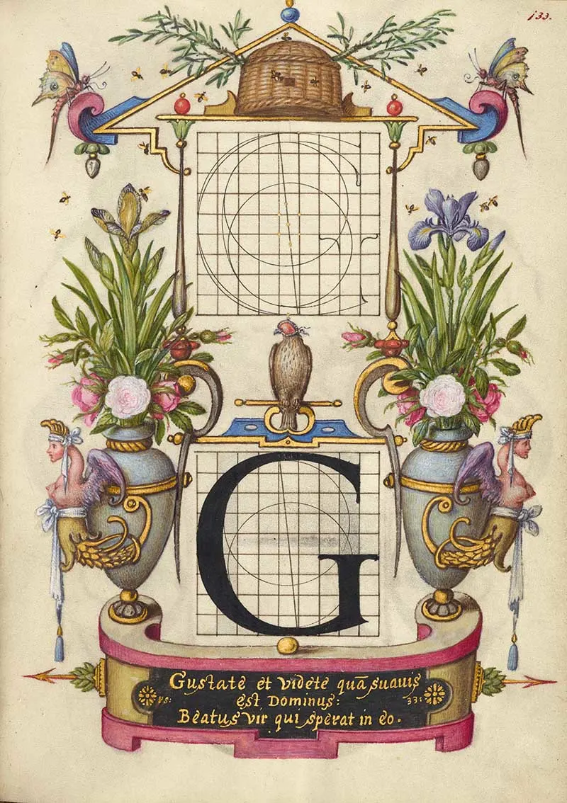
This illustrations on this print are interesing with Monkey kings riding sea horses!
Caligraphy Letters L-P
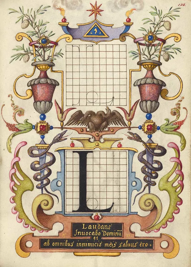
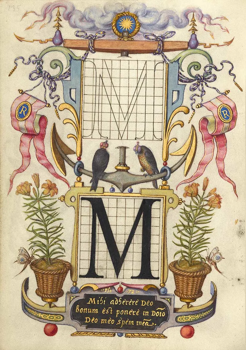
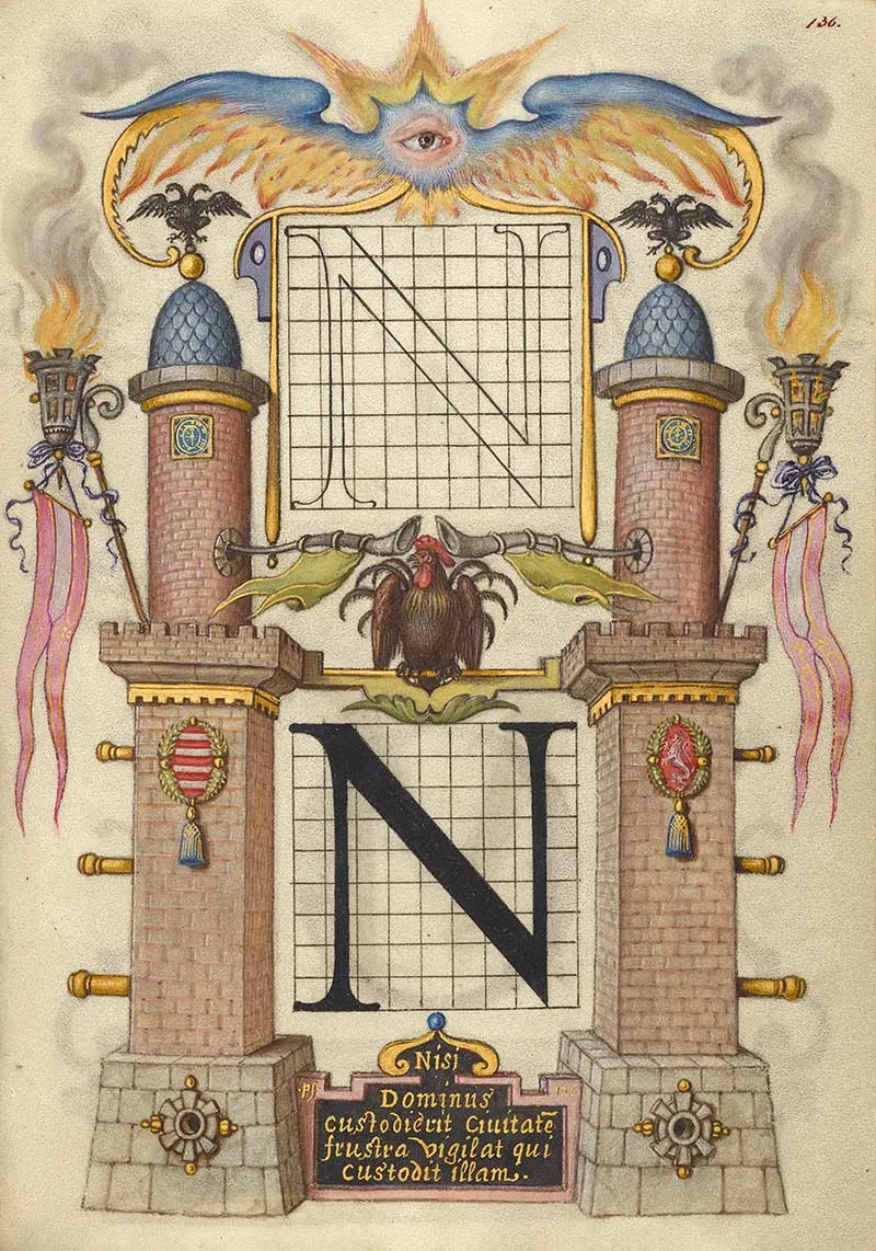
If you notice, the illustrations around each letter are very different and tell a story. But the frame around every letter is different too.
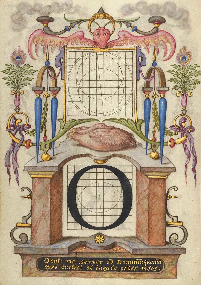
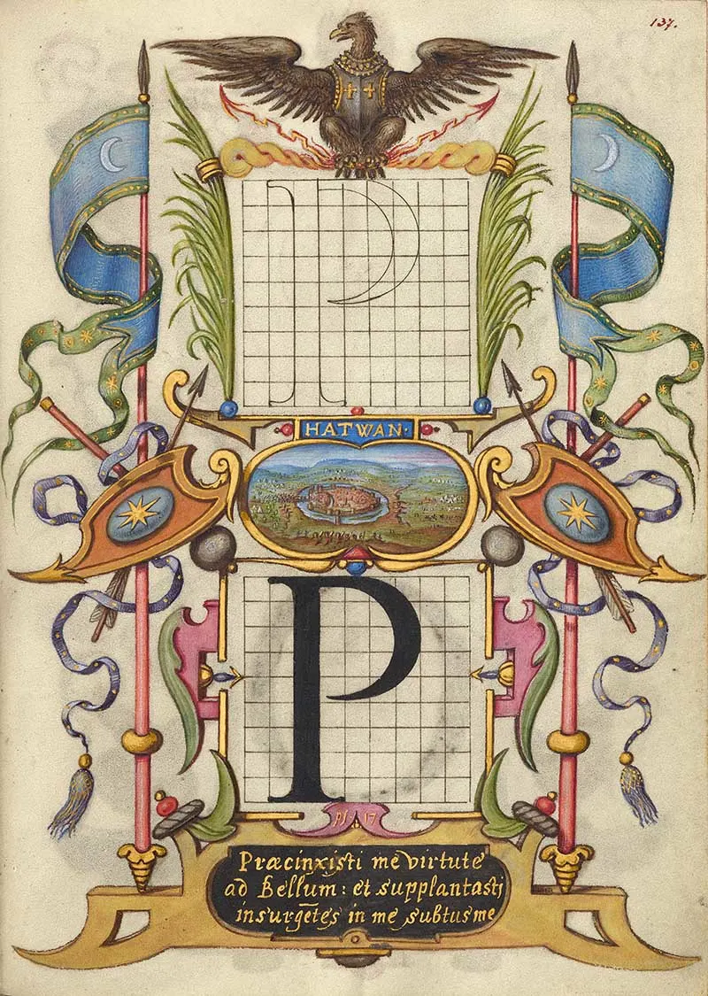
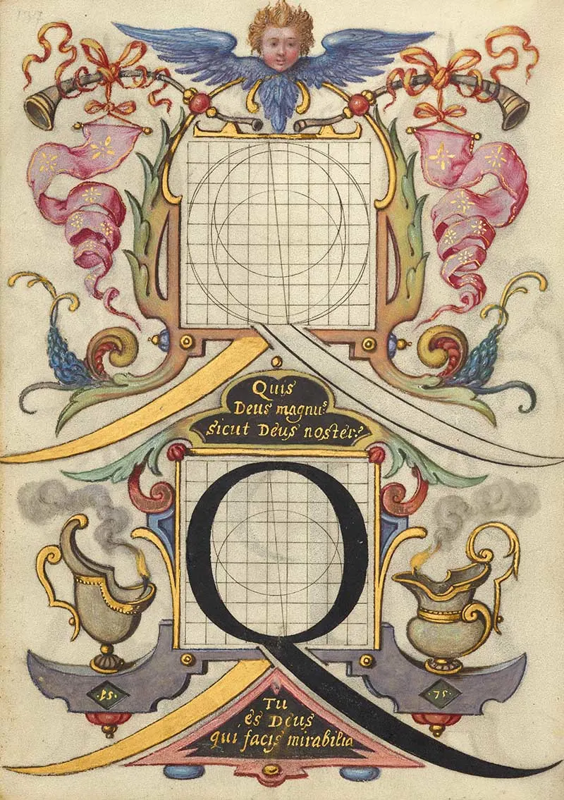
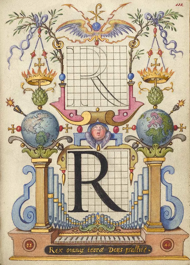
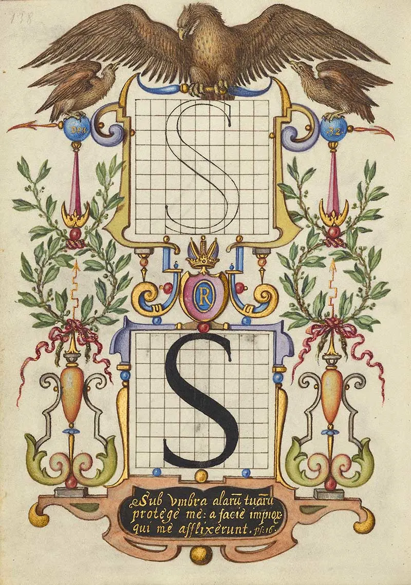
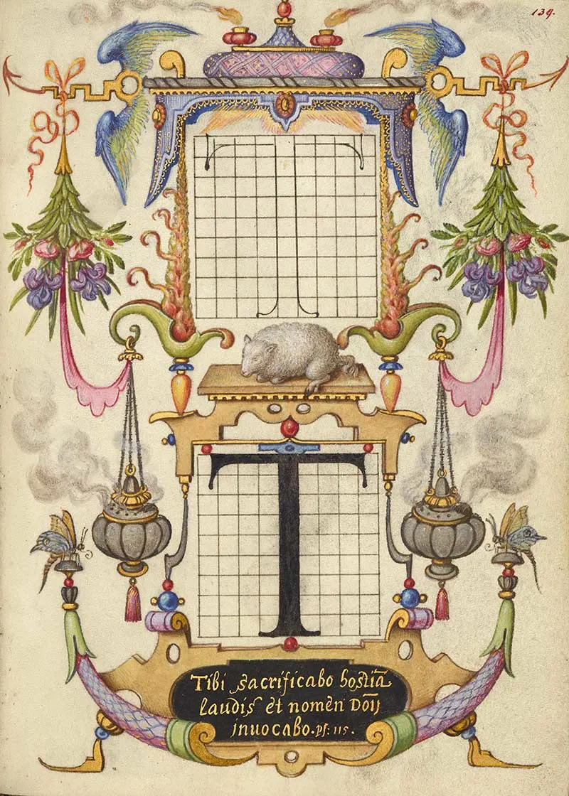
Caligraphy Letters Q-T
The letter R introduces the phrase written in gold at the bottom of the page, “Rex omnis terrae Deus psallite” (Sing praises to God, King of all the earth), which inspired the inclusion of a singing cherub at the centre and a pipe organ at the bottom. The world appears twice, presenting both of its hemispheres,
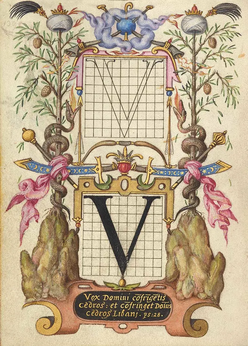
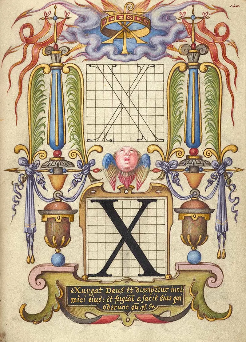
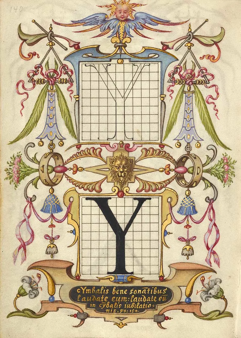
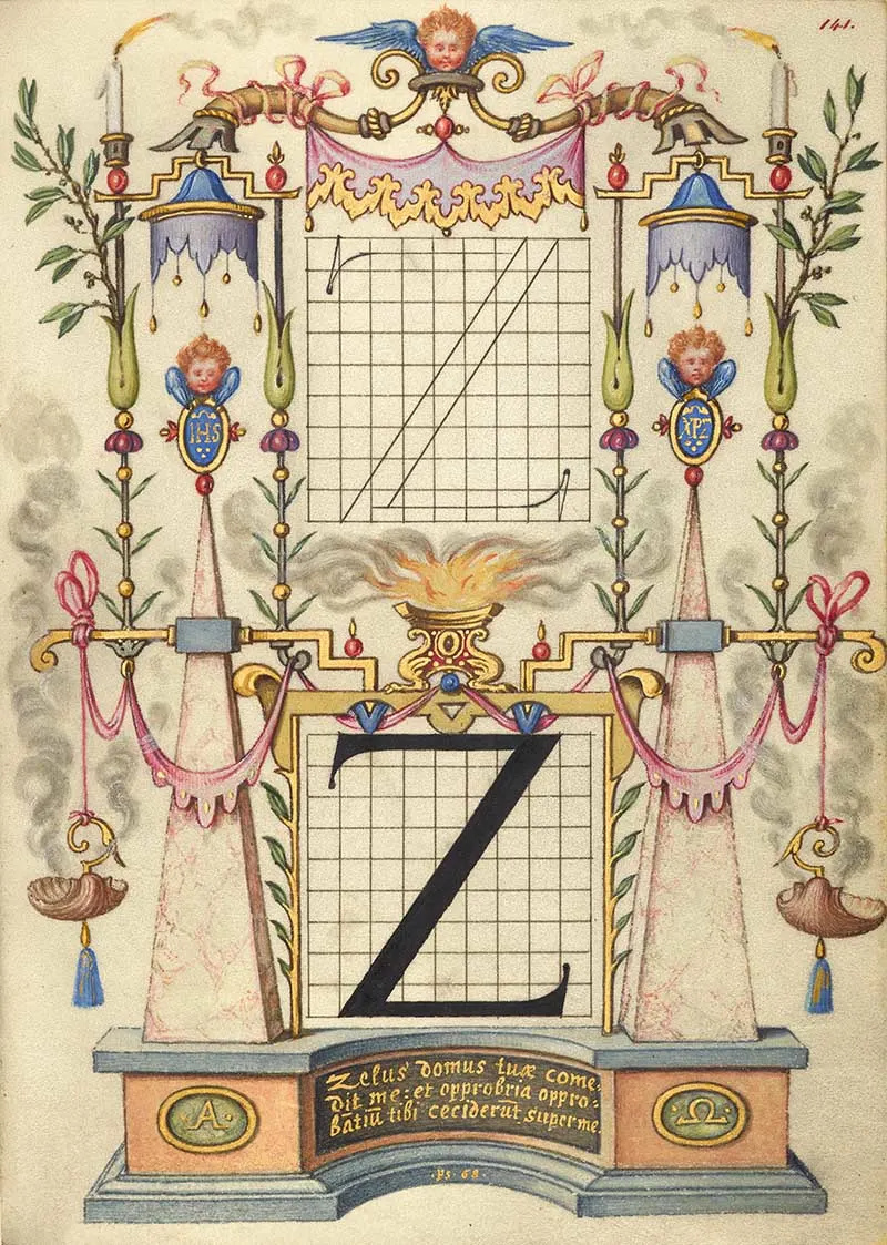
Caligraphy Letters V-Z
The Classical Latin alphabet had only 23 letters, no J, U or W. The V was pronounced like the U in todays alphabet (This is why the W looks like a double V but is pronounced like a double U)
Nature Illustrations, Insects Fruit & Plants 1 -7
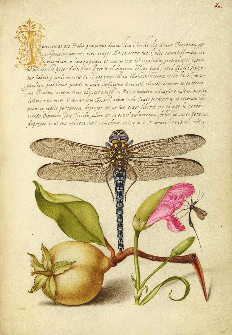
By contrasting the dragonfly’s geometric symmetry in the centre of the page with the more curvilinear, asymmetrical shapes of the pear and carnation below, Joris Hoefnagel created a sense of balance in this illumination.
Hoefnagel’s paintings pay careful attention to nature. You can see that he looked at all the details of the dragonfly – from its wings to its body to its legs – and used all that info to make it look super realistic. The pear – has a fuzzy skin you can practically feel thanks to all these tiny brushstrokes. Hoefnagel imbued the imaginary insect on the right with life and movement as it gently descended on the carnation.
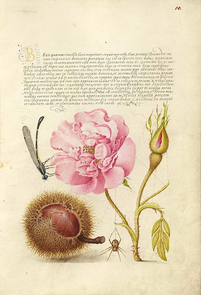
Latin text illustrated with a damselfly, French Rose, Spanish Chestnut, and Spider.
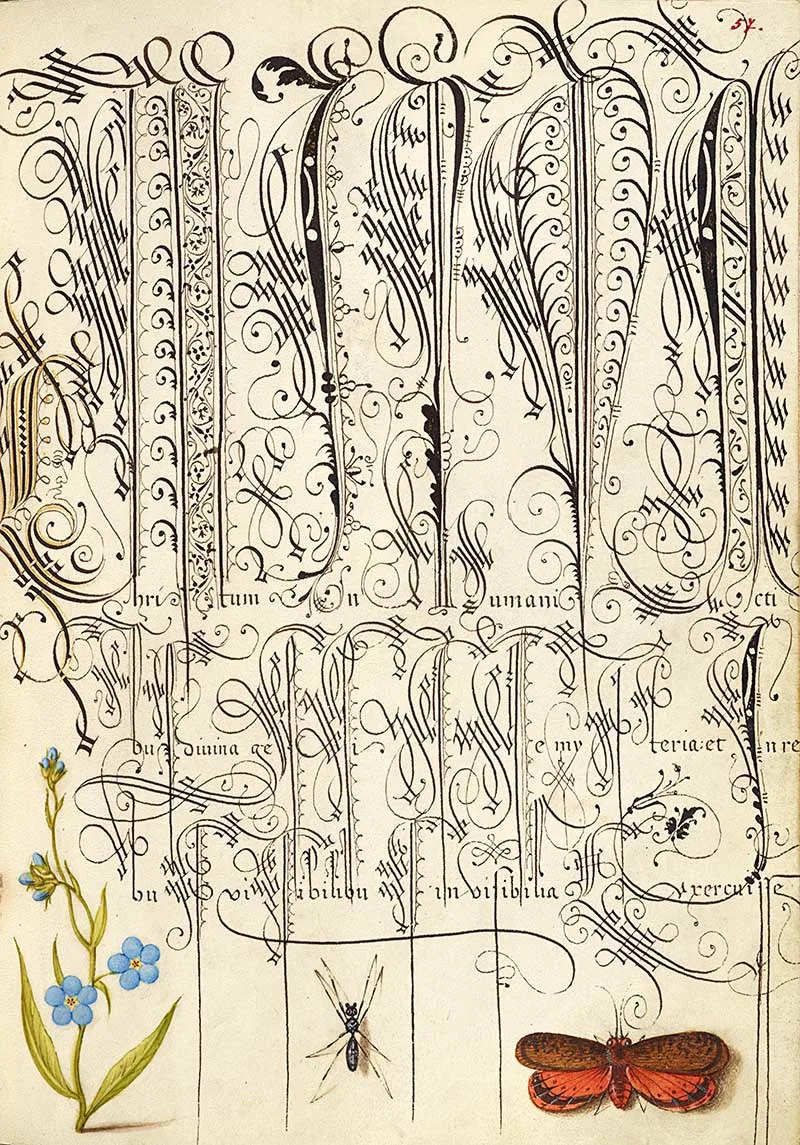
Examples of calligraphy swirls illustrated with a creeping forget-me-not, insect, and planthopper.
4. Gillyflower
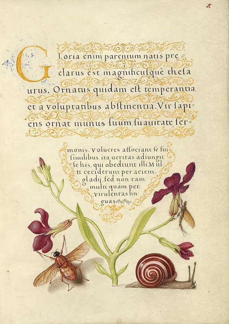
Latin texted illuminated with gillyfower, mayfly, fly, and a snail.
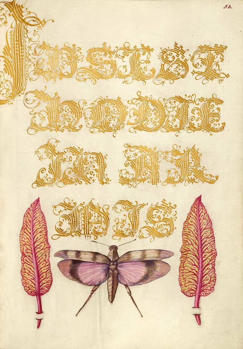
5. Chard Leaves and Red-Winged Grasshopper
The gold text is complimented with the gold on the chard leaves.
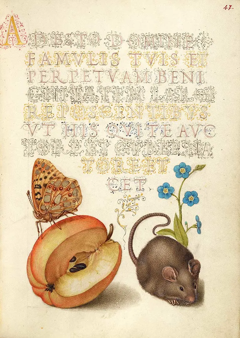
Latin script illuminated with natural history illustrations of Queen of Spain Fritillary, apple, mouse, and creeping forget-me-not.
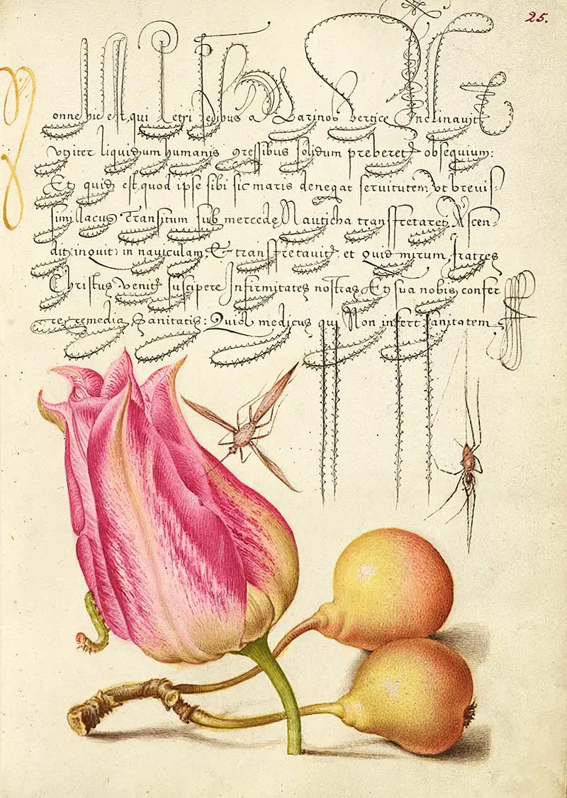
Spiky Latin calligraphy illuminated with an imaginary insect, tulip, spider, and common pear.
Nature Illustrations, Insects, Fruit & Plants 8 -15
On this page, Bocskay scribed a Latin prayer using an elaborate angular script, gold filler for the last line, and ornate flourishes above and below the text.
Thirty years later, Joris Hoefnagel painted the blank space left at the bottom of the page; he carefully coordinated his illustrations with the script already on the page. Hoefnagel painted a pear, caterpillar, centipede, and hoverfly in colours that harmonized with the texts.
The contrast between the yellow and ochre of the moth, hoverfly, and pear and the caterpillar’s black echoes the difference between the gold used for the initial and the decorative filler and the black ink used for the majority of the text. The hoverfly was inspired by Bocskay’s lower flourishes, which suggest the trajectory of a fly.
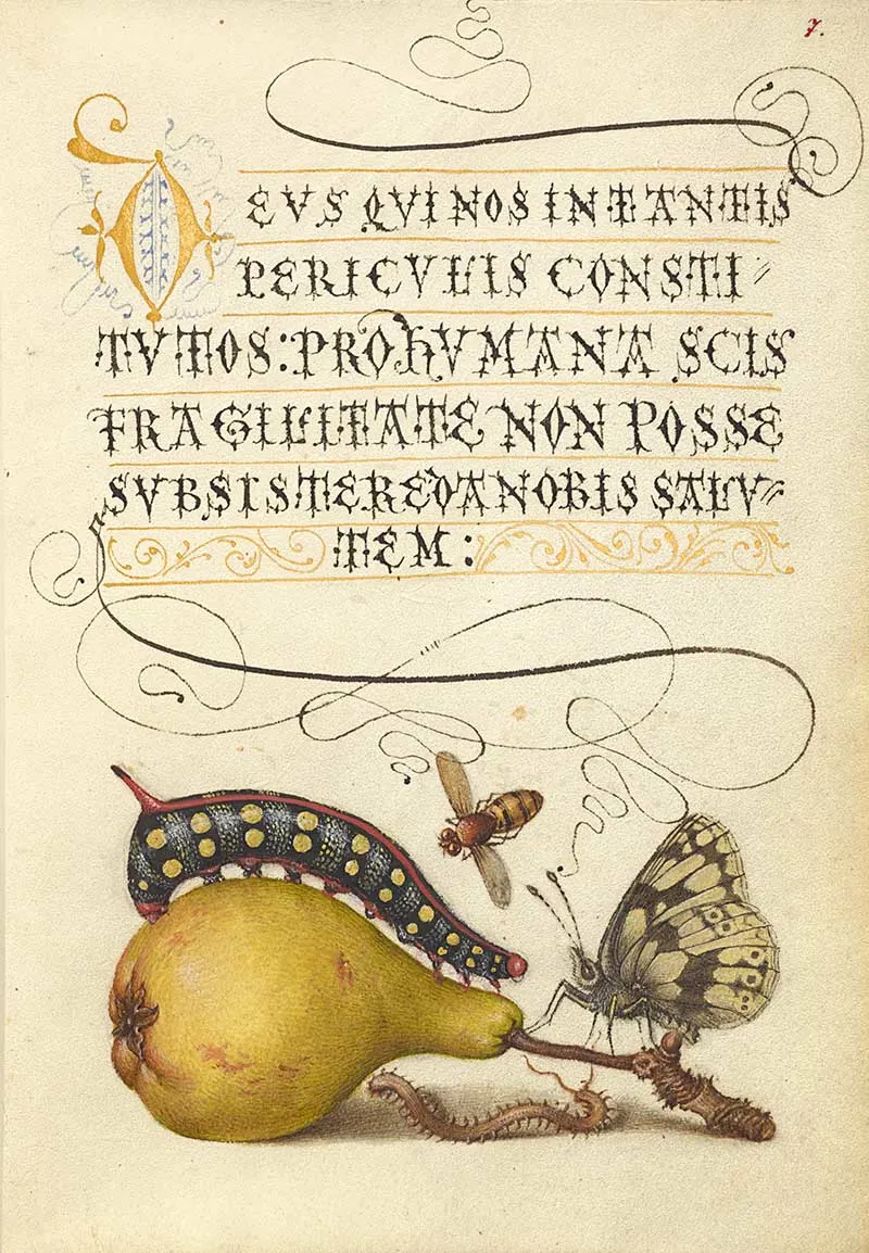
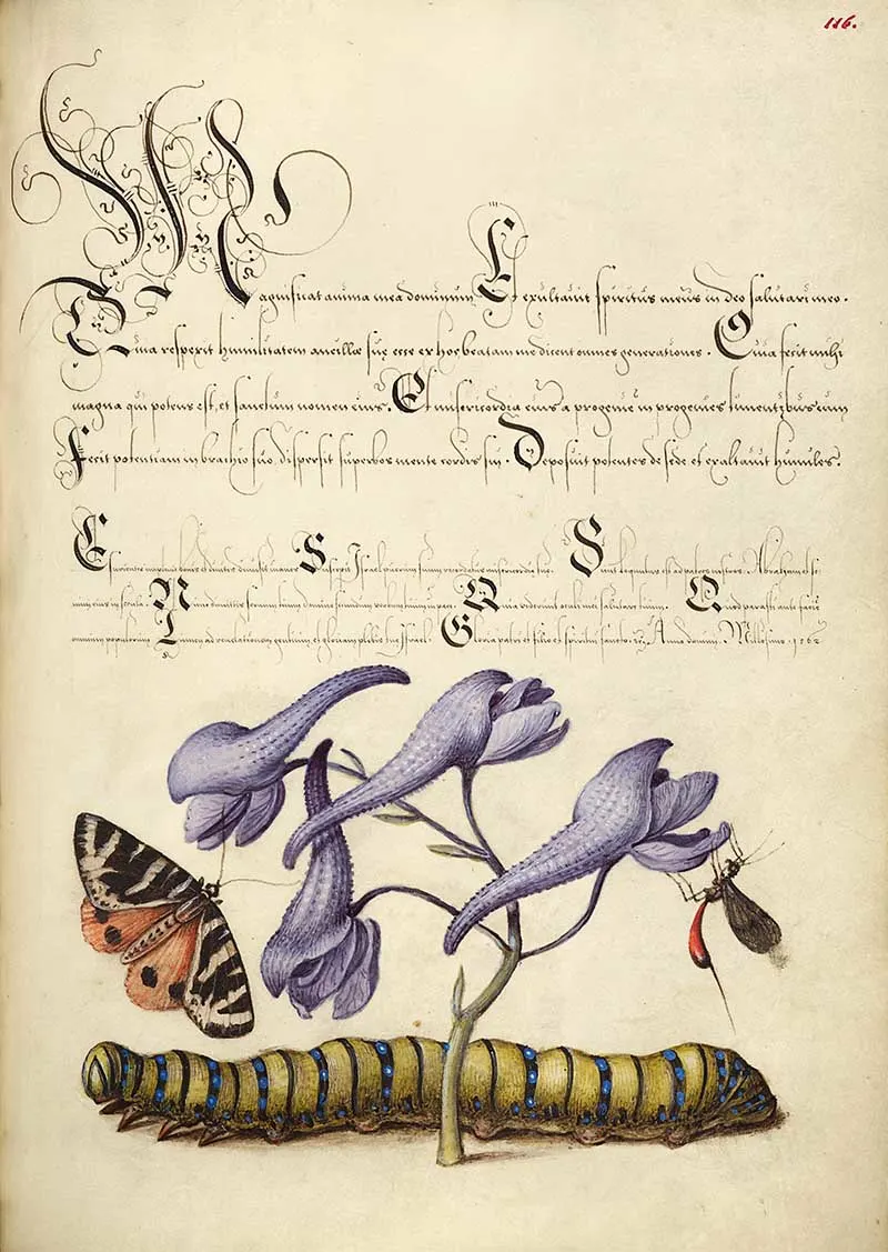
Small calligraphy text illuminated by a scarlet tiger-moth, larkspur and Caterpillar.
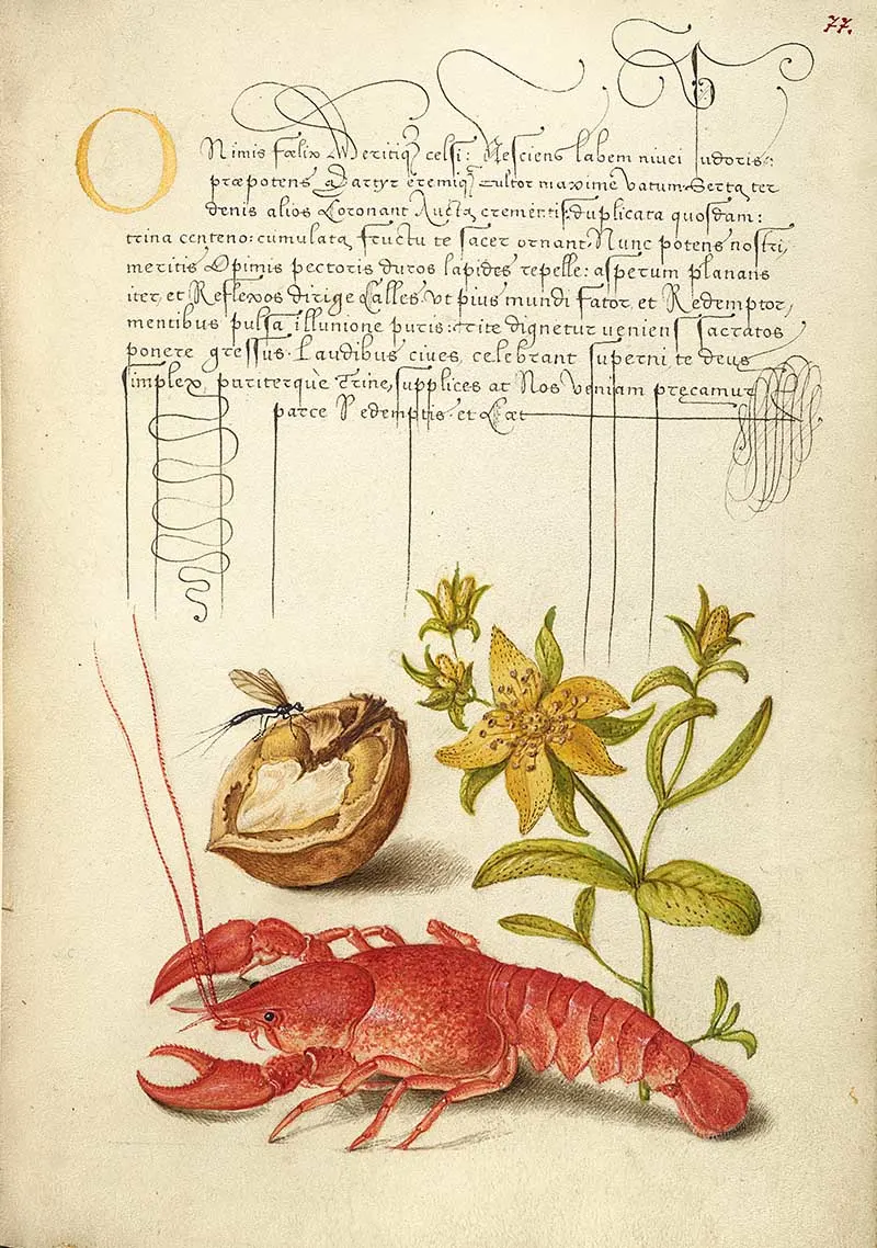
Unidentified insect, English walnut, Saint John’s wort, and crayfish.
11. Tulip & Scorpion
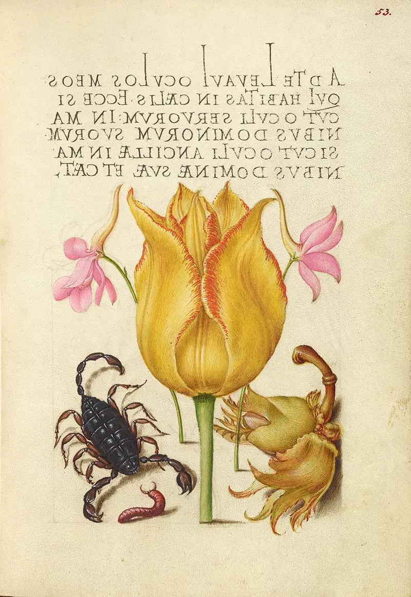
Latin handwritten font in uppercase and mirror image, illustrated with rocket larkspurs, tulip, scorpion, millepede, and European filbert.
12. Garden Pea & Lantern Plant
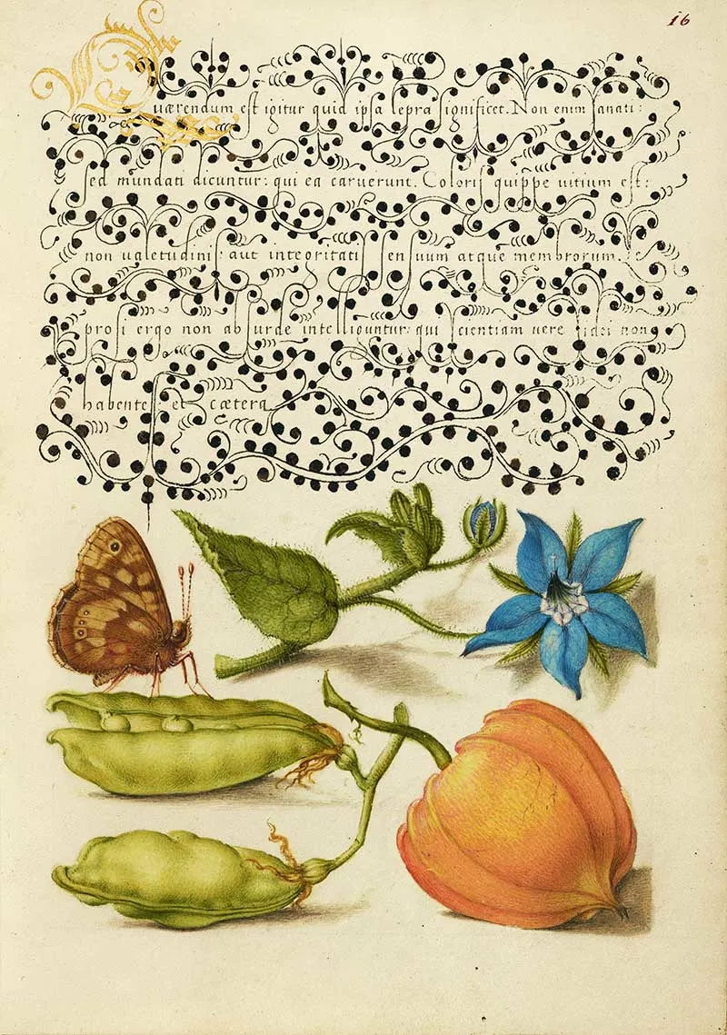
Speckled wood, talewort, garden pea, and lantern plant.
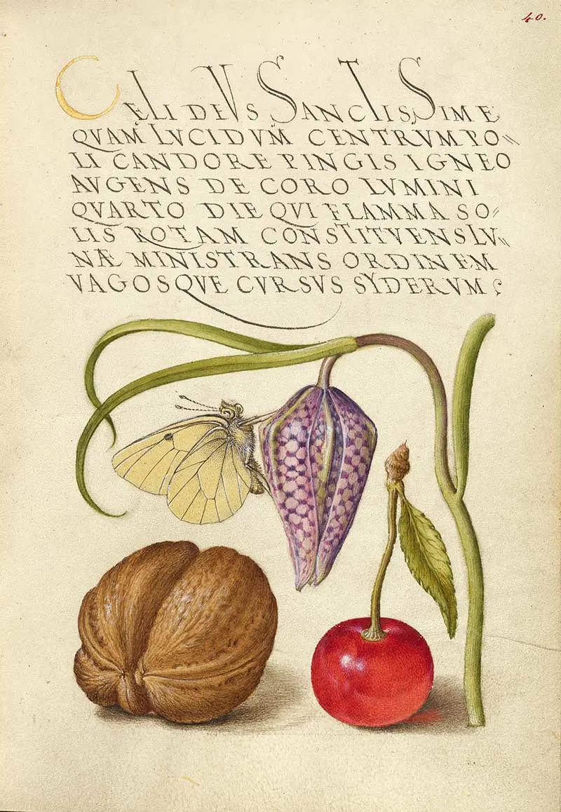
13. Butterfly and Sweet Cherry
Latin script by Georg Bocskay and natural history illumination by Joris Hoefnagel; butterfly, snakeshead, English walnut, and sweet cherry
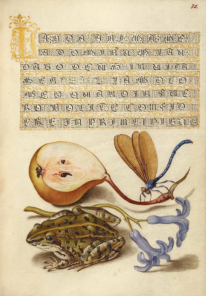
14. Moor Frog
Common pear, lake demoiselle, moor frog, and hyacinth.
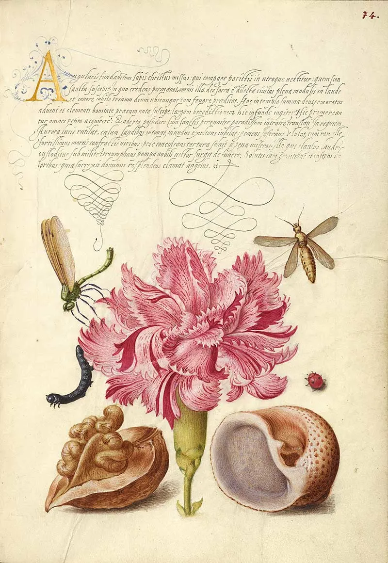
Damselfly, carnation, caterpillar, ladybird, English walnut, and marine mollusk.
Illustrated Symbol Guides
Guide for Constructing the Tironian con and orum
The Tironian is a shorthand system developed by a Roman named Marcus Tullius Tiro. It uses a series of symbols to represent common words and phrases, making it easier to write quickly and efficiently.
The Tironian system was widely used in medieval Europe, particularly by scribes and scholars, and many of the symbols used in modern shorthand systems are based on it.
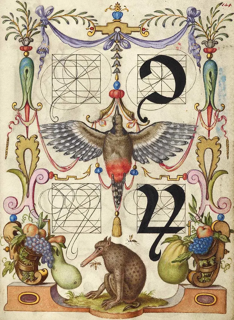
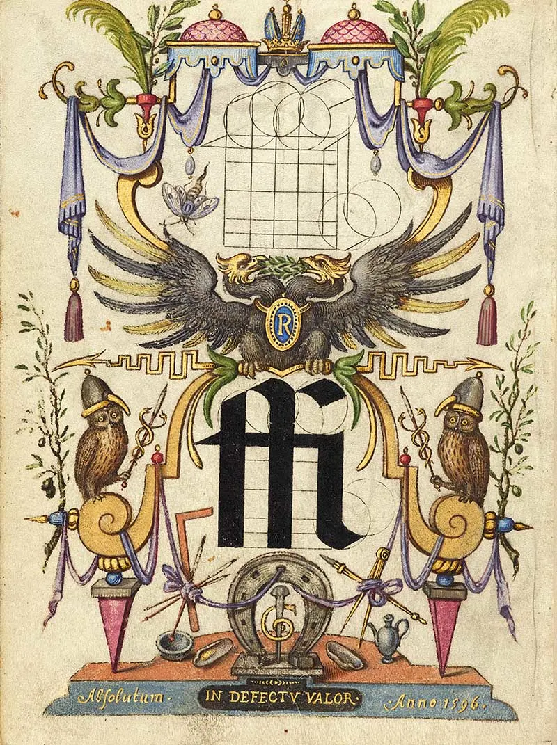
Guide for Constructing the Ligature ffi
In writing, a ligature is a combination of two or more letters or characters that are joined together to form a single glyph or symbol. It’s a type of typographic abbreviation where certain letter pairs are designed to fit together in a specific way, creating a more visually pleasing or efficient form of writing.
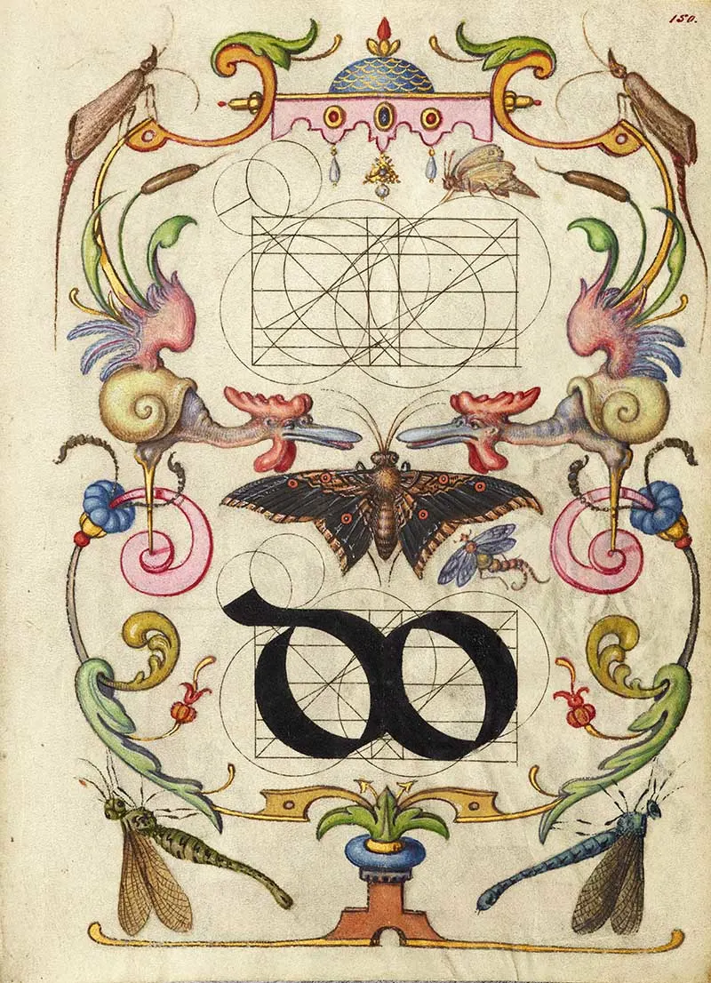
Guide for Constructing the Ligature do
Pin for later
Don’t forget to check out all the other amazing vintage Natural History illustrations and prints on the site. And the art and design related prints.
In particular check out the Maria Sibylla Merian prints of insects with fruit.
If you fancy, you can Buy Me A Coffee Here.

Belinda
Thursday 20th of June 2024
Such stunning art, truly magnificent
claire
Saturday 22nd of June 2024
Thank you so much
Pam
Thursday 16th of March 2023
These are so beautiful, Claire. I just love them. I’ll be featuring this post today at Thursday Favorite Things. 🙂 Thanks for sharing it with us.
claire
Friday 17th of March 2023
Thank you that is lovely to hear.
Kathy
Friday 10th of March 2023
Beautiful collages! Thanks again, Claire!
claire
Monday 13th of March 2023
Thank you, glad you like them.
Cara ~ Vintage Style Gal
Thursday 9th of March 2023
Wow Claire, I am in love with these images. They would make great art for the walls. I bookmarked this one so I can come back and create. Thank you so much for sharing this with Whimsy Home Wednesday!
claire
Friday 10th of March 2023
Thank you so much. They would also be great for decoupage crafts and monogrammed gifts.
Susie
Sunday 5th of March 2023
Beautiful. Thank you for finding and sharing these. Just so beautiful.
claire
Monday 6th of March 2023
Thank you, yes, I agree they are amazing prints.